
|
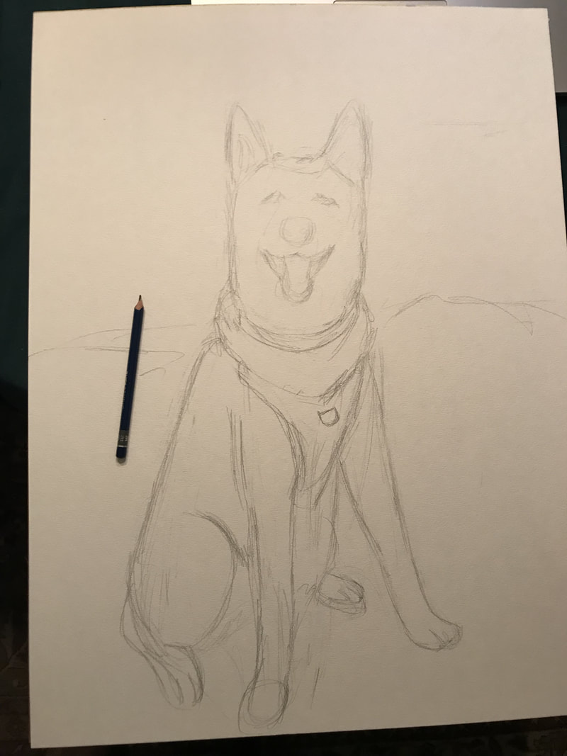
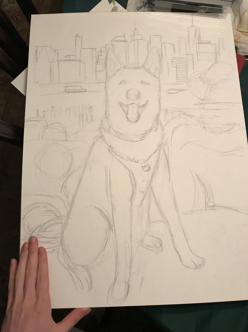
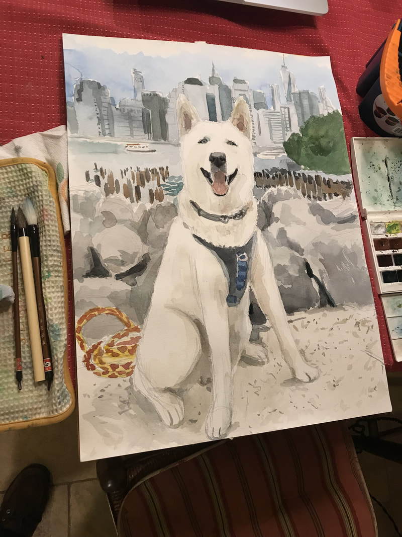
I'm excited to share some progress photos of my most recent commission! This was a big accomplishment for me because it's the largest watercolor painting that I've ever done! (24" X 18") I love painting large works and I had a great time painting this! I'm so excited to send it to my patrons! If you're interested in owning a custom portrait, check out my instagram @ericsantoli or you can order drawings, watercolors and/or oil paintings through my online store!
0 Comments
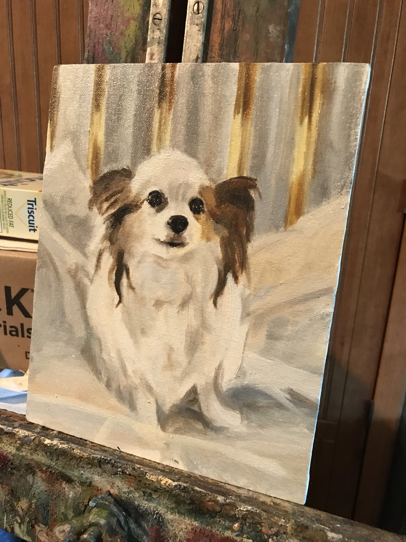
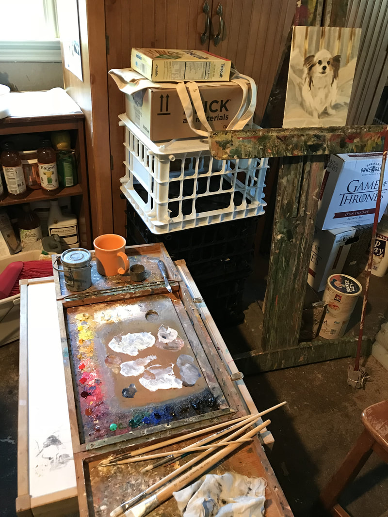
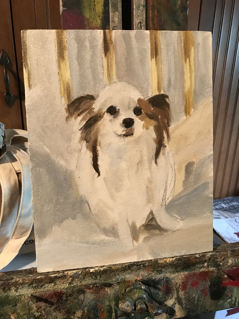
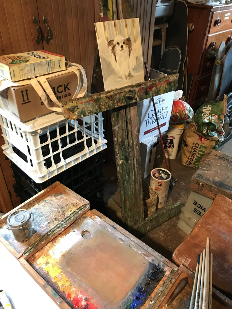
I just finished day 2 on this oil painting portrait of my own dog, Maea. I'm feeling really good about this portrait and I can't wait to work more on it once it dries. A big part of my portraits is being able to capture each pet's or person's expression and I really feel like I got my dog's expression beautifully in this painting. It still needs more work and I've been really busy with commissions lately, but I love painting so much and I'm so fortunate to be able to paint every day. If you're interested in purchasing a portrait from me, check out my oil painting store! I just created it and I'm happy to include it as an extension to my business because I love oil painting so much. Also, there's one more day left to enter my Instagram giveaway! Thanks so much to everyone who's entered! We've gotten an amazing response to the giveaway and I'll be doing some more in the future. I'm so excited because I started a new small portrait of my dog, Maea. It's going really well and I can't wait to get back to work on it tomorrow! I'm going back to my old 19th century palette and the colors are working beautifully! I've been resetting my oil color palette and doing some research about pigments from the 19th century. This was all in response to a recent portrait that I started that didn't turn out well at all. I had been using a "modern" palette of colors, which left the painting feeling incredibly heavy and garish. This got me thinking: "Will the pigments I use have an affect on the outcome?" The answer is absolutely yes.
The materiality of art has an impact on the final outcome. This doesn't mean that if you buy some classic pigments then you'll paint like Rembrandt. But, if you're interested in old master painting and 19th century works, you're missing a piece of the puzzle by not studying the pigments used by those artists. I used to think that I had to fit in to the times I live in. That I had to be a part of our age in art. The truth is that time is cyclical and not linear. You're not old fashioned because you use time-tested and proven pigments versus the "modern equivalents". I'll give the example of titanium white Vs. silver white. Titanium white is an incredibly heavy and opaque pigment and will leave your flesh or other tints feeling chalky and dull. If you look at painting with silver white (which is a combination of zinc white and lead white) there's a pearlescent quality to the mixture (especially useful for flesh-tones). There's no comparison between the two different whites. I'll say also that part of the translucency of older paintings comes with age because pigments become more transparent with age, but silver white, flake white and a few others will help to give you that effect. Take what I say with a grain of salt and test out your own colors and see what works for you. I'll share my current palette below. Yes, some of the pigments are newer, but this is what works for me. Basic Classical Palette: -Silver White -Flake White -Naples Yellow -Chrome Yellow Light -Chrome Yellow Deep -Yellow Ochre -Cadmium Orange -Vermillion -Chrinese Vermillion -Rose Madder Lake -Madder Lake Deep -Venetian Red -Burnt Sienna -Veronese Green (Emerald Green) -Viridian -Cobalt Blue -Ultramarine Blue -Raw Umber -Van Dyke Brown -Ivory Black Additional Colors: -Cadmium Yellow Light -Burnt Umber |
Archives
April 2024
Categories
All
|


 RSS Feed