
|
I had a revelation this morning about the colors on my oil painting palette. I always spend a lot of time thinking about which colors to use and which colors I actually need. It's really hard some times because it's easy to get influenced by your artistic heroes and think that if you use the same colors, then you'll paint like them. The truth is that you should use colors that you like. Of course, the only way to figure out which colors you like is to test out a bunch and then figure out which ones work for you and which ones don't. I'm attaching a picture of my current palette below, which is combination of colors that work for me. Always remember that you can tailor your palette for specific subjects. For instance, if I'm painting a landscape with a lot of greens and blues, then I'm not going to put out all my reds because I don't need them. You could argue that you could mix reds into your greens to neutralize them, but I don't mix color that way so I know I don't need them. And, if suddenly, a red bird lands in the scene, then I can just put a little bit of red on my palette. What I've realized is that it's good to learn about what colors artists of the past have used and to test out those colors as a guide. But to progress as an artist, you'll need to think for yourself and see the world with your own eyes. You'll eventually realize that the colors you use don't actually matter that much. And if you've practiced enough, then you can make a great painting just using the most basic palette! *Many of my readers may know this, but I'm colorblind so I've spent a lot of time studying color for this very reason. Also because of this, I set up my color palette in a unique way that works for me. I always encourage everyone to work in your own style and always experiment with color! 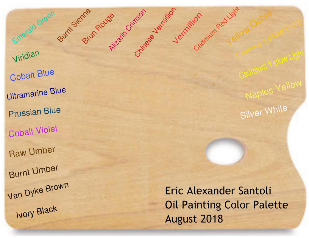
0 Comments
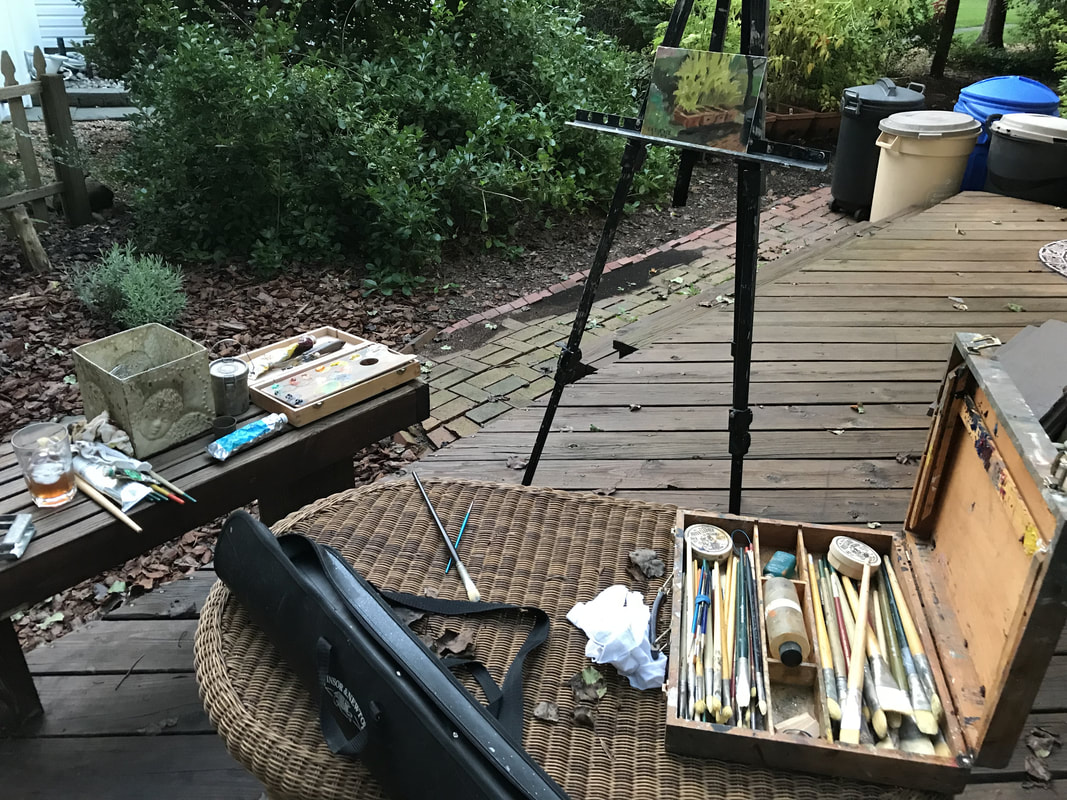
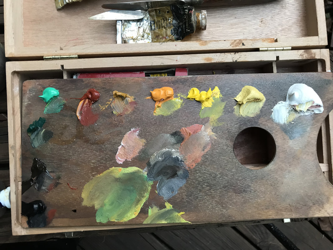
Scroll down for photos! I just got back today from a weekend beach trip with my family and two of my best friends. I did some pencil sketching on my trip but I really missed my oil paints. I got back home early enough today to do a quick 6" X 8" oil sketch. The sun was going down fast, but I always love the evening and dusk so I wanted to do a sketch during that time of day. For some technical information: here's a list of the colors I used for this. Starting at the top right of the palette and circling counter-clockwise: -Silver White -Naples Yellow -Chrome Yellow Light -Chrome Yellow Deep -Yellow Ochre -Venetian Red -Emerald Green (Veronese Green) -Viridian -Burnt Umber -Ivory Black It's a pretty basic color palette, but you could also put out some ultramarine blue and cobalt and have a fully realized landscape palette. I was using a really small palette box so I decided I didn't need any blues or. Another note about colors on your palette: try and figure out what colors you really need instead of setting up a standard palette. And you don't really need as many colors as you think you do. Less is more. I just finished a quick sketch of a golden retriever puppy and decided to do a step-by-step slideshow to show some of my sketching technique. When I'm drawing or painting, my main goal is to go from broad and generic to defined and detailed. I try and start with a general outline gesture to place the main components of the drawing, then I work on shading and go deeper with the detail. Since this was a sketch, it's not super detailed, but I like the way it turned out and hopefully it sheds some light on my sketching technique! Follow me on instagram for more art! |
Archives
April 2024
Categories
All
|

 RSS Feed