|
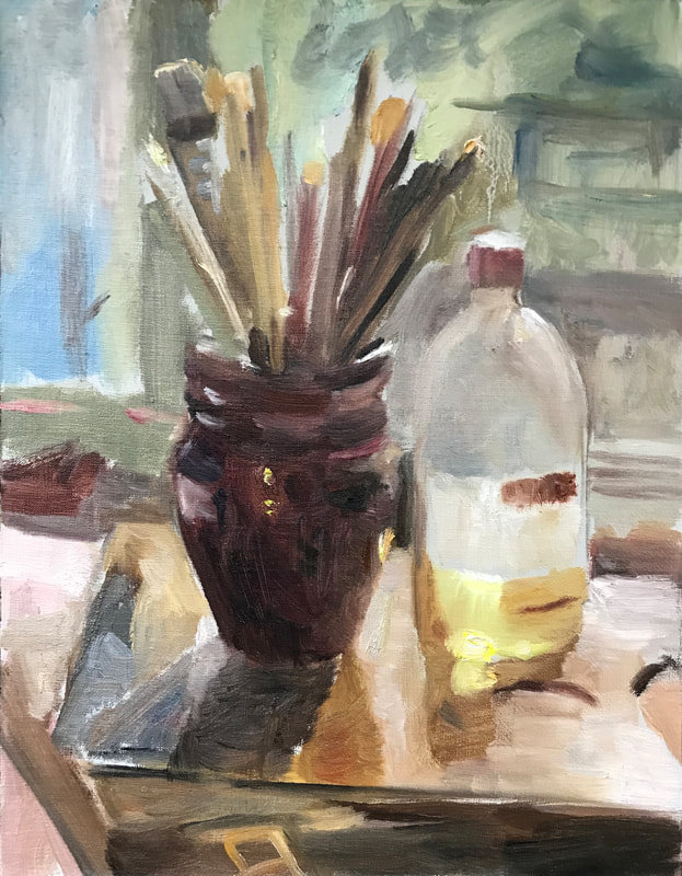
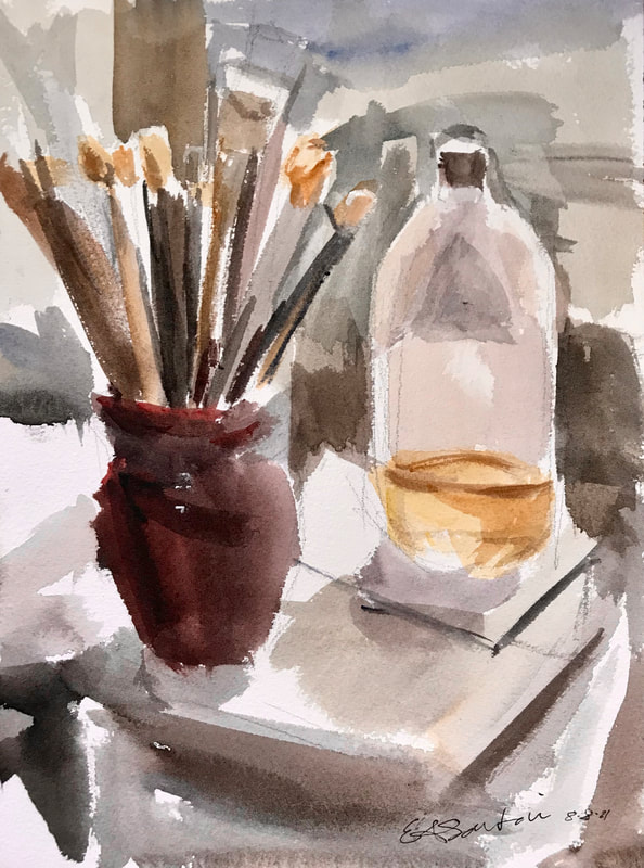
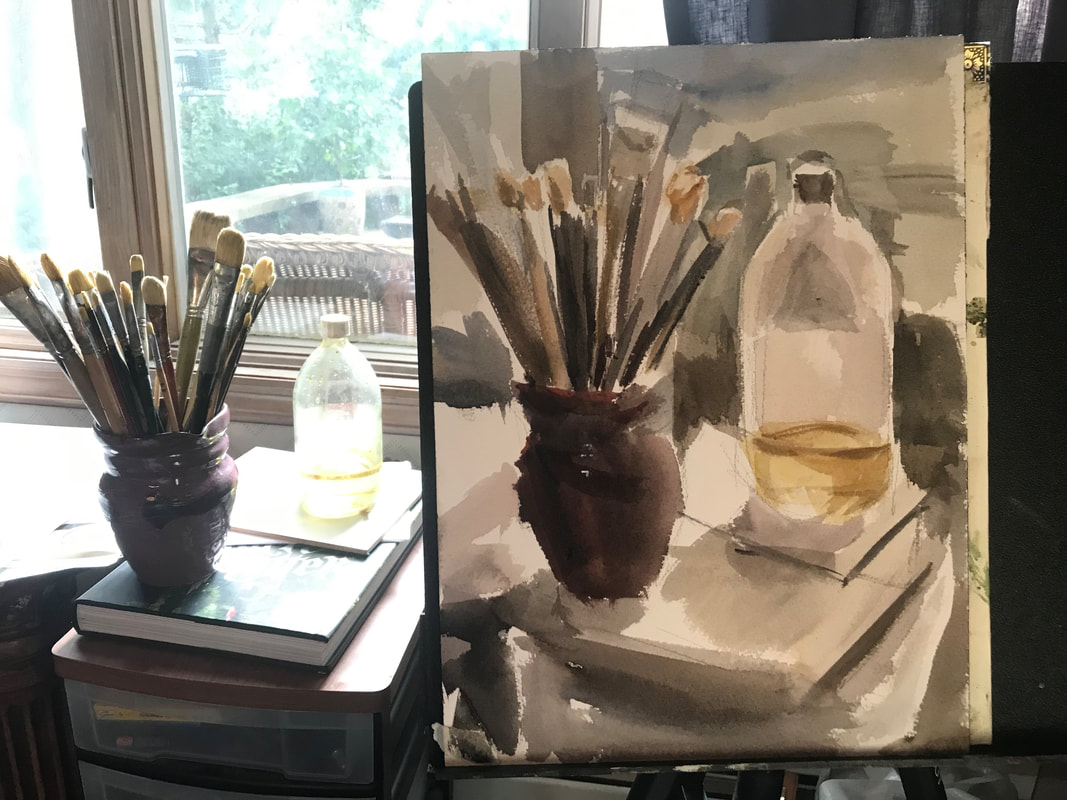
As a fun experiment, I did the same still life scene in oil and then I did one in watercolor. My oil painting palette and my watercolor palette are pretty much the same and I used a few touches of white gouache for the watercolor. I think the watercolor turned out better, but I also did that one a few days after the oil so I had the practice going into it. I painted this still life because I was really inspired by the light hitting the linseed oil bottle and the back light creating a shadow on the brushes. Some have asked me if I prefer watercolor or oils and I really can't choose; both media have certain qualities that are beautiful. I like the thickness of oil paint, but I will say that when a watercolor goes right, there's a certain feeling and luminosity to it that really is magical. Although I prefer painting, I also do a lot of drawing and sketching. Remember that drawing is really the key to being a better painter; if you can draw well then you will be able to paint well.
2 Comments
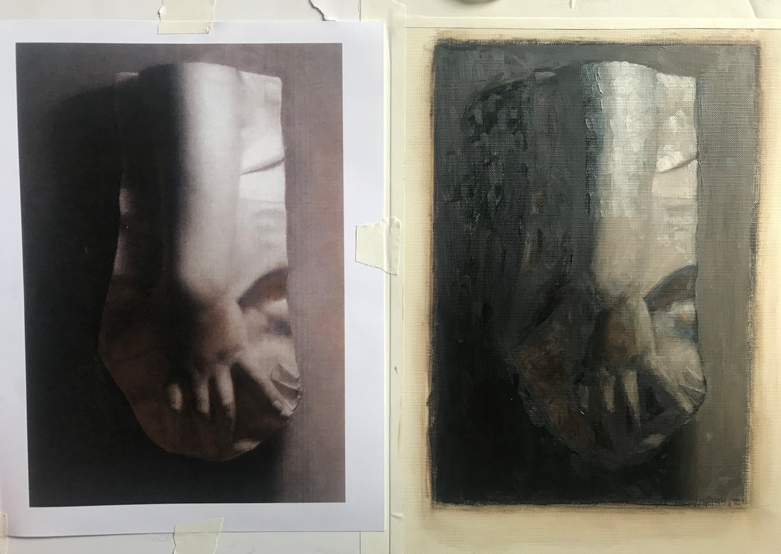
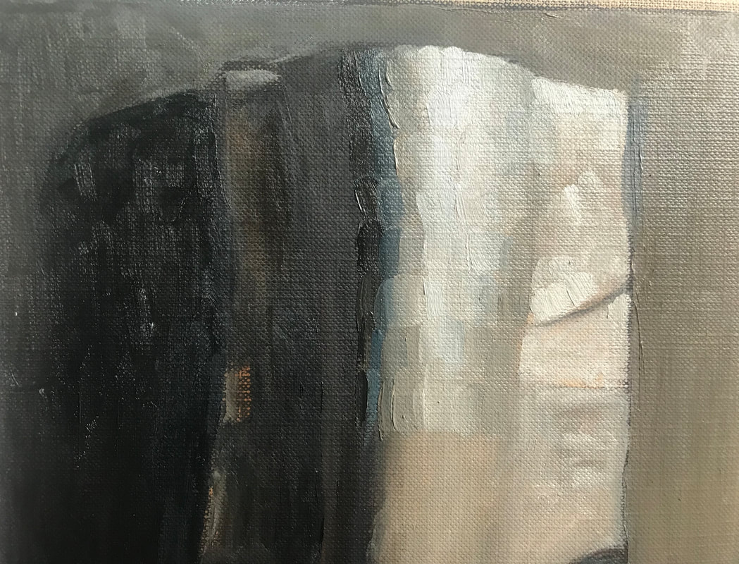
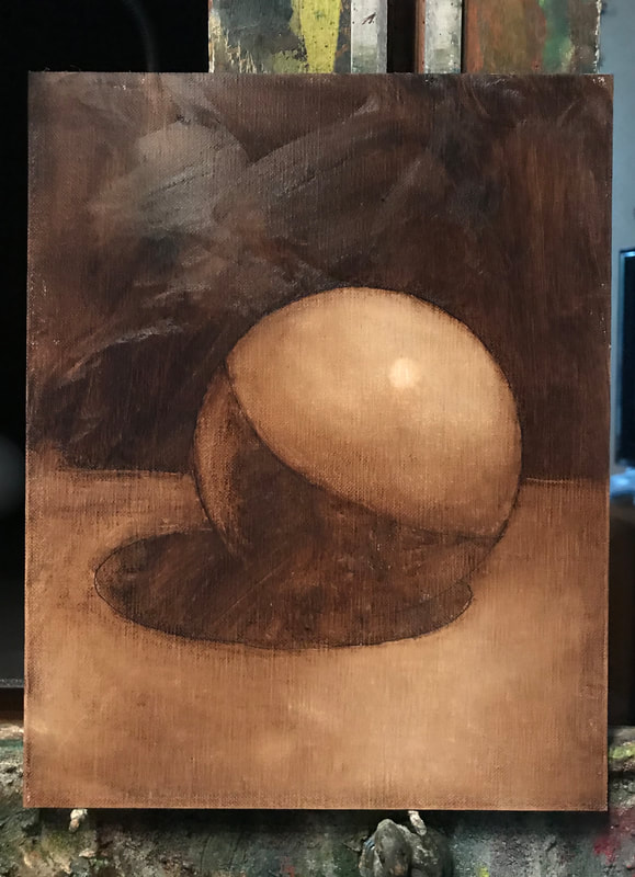
Really happy with the way these pieces look framed. Learning to frame pieces yourself is a great thing to do because it's fun and it saves a lot of money. The pastel of the cat is an older piece from around 2011/2012 of our old cat, Lilly; I should have framed it years ago, but now it's properly framed under glass. The garden painting is titled The Main Garden (16" X 14") and it's going to be available for sale at the end of August at the Geary Gallery. As always, these frames are from Art to Frames in Brooklyn, N.Y.  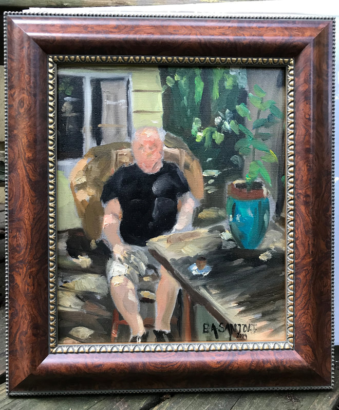 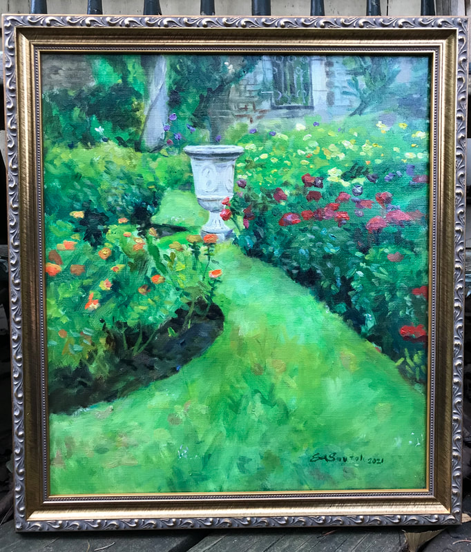   Warm/Cool Tiling Palette - Burnt Sienna + Ultramarine Bl. + White Warm/Cool Tiling Palette - Burnt Sienna + Ultramarine Bl. + White A very interesting method of painting that we're learning at the Florence Academy is called tiling. The idea is to create small color swatches in a mosaic manner to define the exact color and value of each stroke. No blending allowed. For anyone interested in learning to paint, I suggest trying this method with just black and white. Remember that it's not about creating a beautiful painting, but being able to mix color to get an accurate illusion of form. Don't be lazy with it and you'll learn a lot. From a distance, the swatches resolve into a rounded form. Your eye blends them together from a distance. Felt like sharing this wipeout that I was quite proud of. The color for the wipeout is ultramarine blue and Winsor & Newton burnt sienna. We'll be using those two colors + white to paint the sphere. The setup has orange paper on one side wall and blue paper on the other side to emphasis the warm and cool. It's a good exercise. |
Archives
April 2024
Categories
All
|


 RSS Feed