
|
I've written about self portraits before, and every time I paint one, it acts as a stepping stone to see how far I've come. I don't know exactly, but I think I've painted about 12-15 finished self portraits. I did a lot of them when I was in school because I didn't always have a model to pose. Before my most recent one, the last self portrait I did was when I was a senior at Penn and I was 22 years old. It came out very well and I think it took me about 3 weeks to paint. I have it hanging above my bed and I look at it every day. It marks a very happy period in my life and I'll keep it forever. Every painting I do is very dear to me and makes me sentimental when I look back at them. In the two years that are between these two self portraits, I've learned many things. The reason for my growth is because I've painted a lot of paintings. Some of them are pretty bad, but I've done a lot of commissions that I'm super proud of. I'm starting to learn that the materials, technique, palette and everything are all secondary to the great poetic theme. Of course, I value technique immensely, but it will always be subservient to the theme. And the truth is that my technique is really simple and I use a fairly basic palette. A lot of my paintings may look very realistic, but they actually aren't. Aside from doing portraits, I don't like realism; even my most accurate portraits are idealized. The other main thing that I've learned is how important tonal arrangements are in a painting. I sum it up in the follow order of importance: Line -> Value (tone) -> Color. It may be my colorblindness, but I place a great deal of importance on the value. I keep learning every day, I paint almost every day and I'm still addicted to it after 10 years. *See pictures below.. 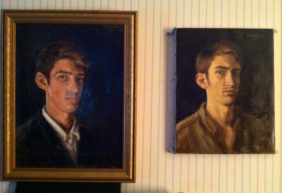  "Self Portrait Aged 24" - Tonal
0 Comments
I couldn't help myself from starting this self portrait. The light's fading in the studio quickly, but I was able to lay in some basic tones. It's exciting because I really feel that I'm developing my own process of painting based on accurate value and academic technique. I feel lucky to be colorblind and have a sense of lightness and darkness, without being bogged down with particular colors. I'm also thankful for being able to deeply study Bouguereau's technique. Technique is so important and these self portraits are stepping stones along my way. 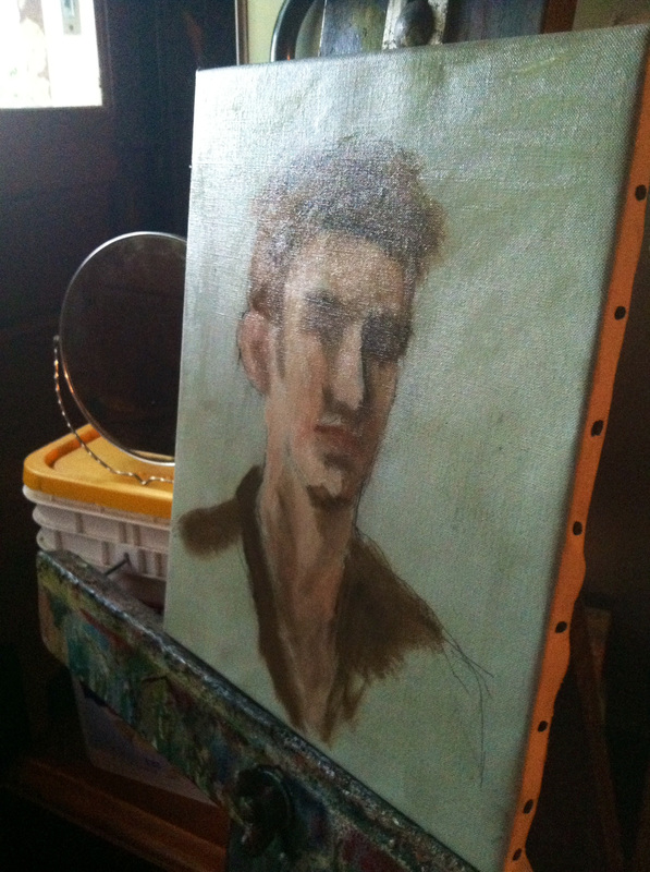  As the painting nears completion, I like to do a value check to make sure the values help to support the subject of the portrait. Luckily, this step is made insanely easy by modern technology. Any iphone or Mac can easily turn a photo into a black and white image so you can check your value. Once everything is set into place as fair of the larger planes, the success of the painting depends upon the slight adjustments. Which is why checking the value is so important. I consider myself actually lucky to be colorblind because my world is faded, so I follow value more naturally. of course, it's a double-edged sword because I need pay really close attention to my color palette. 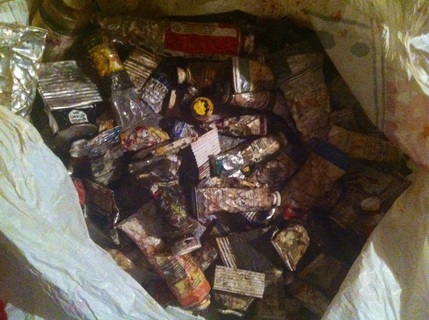 Finding your own palette of colors is an ongoing process, with frequent changes involved. There are many colors out there and it can be overwhelming to choose what to work with. I actually have three heaping bags of oil colors that I've accumulated over the years; I have used and studied all of them in an effort to counteract my colorblindness. And many of them I have had on my palette at one point or other. Many of my palettes were also inspired by artists of the past. When I admire an artist, I usually begin by studying what colors they use. And then the natural connection is to believe that using their colors will somehow enable me to paint as well as them. This is completely wrong and often times will impact your painting negatively because you are blindly using a pigment without learning the properties of the pigment. The artist whom you respect probably chose that palette because they tried many colors and learned about each color before using them. The best way to prevent this idol worship is to strip away the colors to a very basic palette. You truly only need a handful of colors to complete a painting. Being colorblind, I am a strong believe in the power of value over anything else; your basic palette should have a wide value range. A good basic palette to begin with is: -Titanium White -Flake White -Cadmium Yellow Light -Cadmium Red (Or Vermillion) -Alizarin Crimson -Burnt Sienna -Cobalt Blue -Raw Umber -Burnt Umber -Mars Black I can definitively say that these colors are essentials to any palette. I use a fairly basic palette myself, but I will suggest that you try and figure out what colors you NEED instead of what colors you THINK you need. I recently painted a cat's eye that was a pale yellow color and I realized that I needed naples yellow to achieve the value and effect. I normally don't use naples yellow because it tends to wash my colors out, but I have to say that it's what I needed for this cat's eye. Below is my current palette and I may add colors or take away colors now and then, but I encourage you to go out and find your own colors and try as many as you can. Fill bags with color and keep them in storage because you may need that one special color someday. 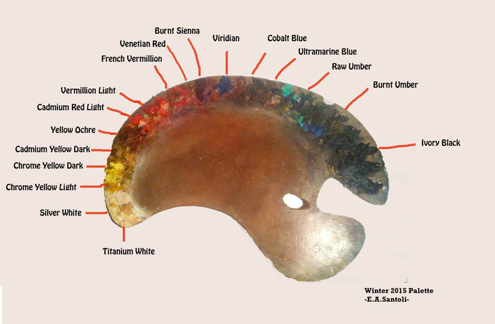 |
Archives
April 2024
Categories
All
|
 RSS Feed