I'm very happy to share a review of these two books by Everett Raymond Kinstler. Although I never got to meet Mr. Kinstler in person, I had the privilege of sharing email correspondences with him over the course of a few years. His emails were always filled with encouragement and thoughtful critiques of my work.
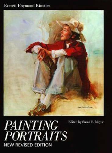
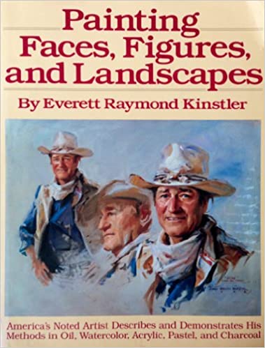
For Christmas this year, I received both of these books as presents. I'll start by discussing Painting Portraits, published by Watson-Guptill in 1987. The book is 144 pages and has high quality illustrations of Mr. Kinstler's work. I was very excited to read this book and it did not disappoint. For anyone who's interested in portraiture, I now consider this book a must-read. What I like about it is that it has really practical information as well as information about mindsets and philosophies of making art. There's also information about Mr. Kinstler's history and the way he started doing portraits, which was fascinating. Mr. Kinstler's process and materials are also covered, which prompted me to add and remove a few colors from my own palette. It doesn't feel like reading a typical art instruction book because it has a nice narrative flow to it. I really can't find any faults with this book and will enjoy re-reading it at other points in my life. Painting Faces, Figures and Landscapes, was also published by Watson-Guptill, but in 1981. It's 143 pages and also has faithful illustrations. I would recommend this book for anyone who is more of a fan of Mr. Kinstler's work and more interested in his personal history. Painting Faces, Figures and Landscapes includes technical information, including demonstrations and his materials list, but Painting Portraits has more information about the practical nuts and bolts of painting. Since I'm also a watercolor painter myself, I enjoyed Painting Faces, Figures and Landscapes because it shows Mr. Kinstler's watercolor and drawing methods, which are not included in Painting Portraits. If you're interested in watercolor and drawing materials and techniques then keep this in mind. Mr. Kinstler is a wonderful writer and his sense of humor gives these books a light-hearted feeling which I thoroughly enjoyed. Like many great art instruction books, this book will satisfy you if you're a beginner or advanced. Both of these books are very reasonably priced and I guarantee that you'll find them very useful, inspirational and worth reading.
0 Comments
I started keeping a journal when I was about 19 or 20 years old. I'm going to be 30 this year so that makes it about a decade of journaling. I write about all sorts of things going on in my life, painting ideas, discoveries, philosophies, sketches, painful moments, heartbreaks, poems, funny moments, and anything else that. It's a creative outlet for me and a way to remember and preserve what I've experienced.
But this post isn't about my journal, it's about what I use to write in my journal. A fountain pen. For years I searched for a smooth and flowing style of pen to journal with. I tried everything from ballpoints to gel writers to sharpie pens. For years, I used a Pilot G 2 - 07 pen, which seemed "good enough". A few years ago, I started to do research about old types of pens. I'm not sure what prompted it, but it was probably just my fascination with tools and techniques of the past. It also seemed that old letters and documents had a certain flow and beauty to them. I ended up getting a cheap, red plastic fountain pen from Staples. I tried it out and it bled everywhere, including through the paper and became a mess. It wrote for a few lines and then would skip. The worst part was that the ink cartridges ran out very quickly. If this is how fountain pens are, then I would stick with the Pilot G 2. Then for my birthday, my Mom got me a very nice Sheaffer Sagaris fountain pen with my name engraved on it from Fahrney's Pens. It was a complete surprise, but I had had such a bad experience with the cheap fountain pen that I wasn't sure if I'd like it. Well, the difference between the cheap pen and the Shaeffer (which costs about $100) was night and day. Like so many things in life, the quality is what matters. The Sheaffer didn't bleed onto the paper or skip lines at all. It was very smooth and felt great in my hand. The other main difference is that the Sheaffer has a refillable converter to hold the ink. It really opened my eyes to this beautiful tool. So what makes a fountain pen so nice to write with? It's hard to describe, but there is a flow to a fountain pen which makes it feel more like painting than writing. You can write faster and allow your thoughts to flow with the ink (this also comes in handy for sketching). I had to make a couple of adjustments with my journals in order to accommodate the fountain pen: I now journal in a Letts of London book that has fountain pen friendly paper. A fountain pen's ink will bleed right through most paper, including Moleskines. It may seem like a lot of hassle just to do some writing, but I can hardly write with any other pen now. Like most tools, there's a learning curve to using fountain pens and there's some homework to do in order to get the most out of your pen. Some quick tips while I'm thinking about it: Look up how to properly clean your pen, don't take your fountain pen on a plane, store your fountain pen with the nib facing up to avoid ink collecting in the nib and if you're not going to use your pen for a while then flush the ink out. The final thing I love most about fountain pens is that the nib of the pen becomes adapted to your unique way of writing. From what I've read, this has to do with the elasticity of the nib and the way it becomes polished as you write in your style. For that reason, you shouldn't share your fountain pen with anyone else. (That might be the only valid reason to ever be selfish with your tools). Any questions, feel free to leave me a comment below: When I first learned about oil grounds, I was immediately fascinated with the material. There's no comparison between the acrylic "gesso" grounds and the surface of an oil ground. But even with oil grounds, I have found a startling difference between titanium white grounds and lead white grounds. For me, titanium grounds have a high absorbency that catches the paint and sucks it in, while lead has a buttery type of surface that allows the paint to glide. I've tried many varieties of commercially prepared oil ground, but was always disappointed by not being able to order lead and a custom tone of light gray (which I prefer).
I am very familiar with preparing my own grounds and my previous practice was to prepare my own lead primed grounds. I'm glad I know how to prepare my own grounds, but this process is time consuming, very messy and difficult to get right all the time. Nevertheless, I am an artist that believes in the importance of materials. I believe the same philosophy applies to chefs: no matter how good of a chef you are, you can't make a good meal out of bad ingredients. So I reached out to Mr. Angel De La Cruz via email to inquire about getting a lead primed, gray toned, oil ground. Angel wrote back to me very promptly and said he actually had a roll in stock that matched my specifications. I was very excited, but a little nervous. Would the gray be the right value? I didn't want something too dark or too light. The tone of gray ended up being spot on, not too dark or too light. The linen is double primed also which creates a smooth surface, but still has the tooth of the fabric-- perfect for portrait work. I've included some photos below, but it's difficult to capture the quality of this canvas in photos. I know the canvas is also very well sized because none of the oil ground has seeped through to the back of the canvas. For anyone who doesn't know about oil grounds: you need to have a size (a glue) to act as a barrier so that the oil ground won't reach the linen or canvas because that can cause degradation over time. It's very important to keep these traditional artistic practices alive which is why I only want to support companies that make great quality materials. Angel and Ben are wonderful to do business with and I'm so happy that I found them. I want to thank companies like A E Art Canvas Priming, Natural Pigments and Rosemary and Co for keeping these traditions alive. The roll that I ordered is: #13 Linen, 57"X 6 Yds, DP Gray Lead. I don't want to list the price in case their prices change, but I can tell you that it was very reasonable considering what most other companies charge for oil grounds. I don't think that they have a website (which is cooler in my book) but you can contact Angel and his son, Ben, at the address and email below: A E Art Canvas Priming 605 East 132nd Street Bronx NY 10454 (718) 665-3814 Email: aeart05@aol.com I just read this awesome article about the singer of The Lumineers, Wesley Shultz, and his thoughts on motorcycles and music. I'm a big fan of their music and it's interesting that Shultz grew up in Ramsey, N.J., close to where I live and grew up. As an artist, I completely agree with the connection between motorcycles and the genesis of ideas. There's something meditative about riding that cultivates creativity. This article was sent to me in the Triumph newsletter which always has great content. Click on the image below to read the article and to watch the video. "'I’ve been riding anytime it’s a clear day. It’s become a catalyst for coming up with lyrics and melodies. You feel like you have this hit of dopamine, but you have to be ready to react quickly. You can’t be on your phone. You can’t be anywhere else in your mind.'” |
Archives
May 2023
Categories
All
|