 The more I paint and draw, the more I realize the limitation of the media. This is sometimes discouraging when the natural world produces lights that are far brighter than the white on my palette. But having knowledge of what painting can and can't do is what makes a great painting. The limit itself of paint can be bent by knowing techniques that allow for it to bend. And that is what excites me about painting: using color, value and composition to create an image that is more than any photograph could ever be. The rest of it all doesn't really matter which is why I included some pictures of my palette and paint box. I use very rough bristle brushes, a basic turp and copal medium and a standard academic palette ranging (all of it constantly changing and evolving). Another thing that really gets me going is the fact that these pixels on your screen right now can never accurately produce the pigments of a painting. The airy, sometimes smoky quality of paint is really impossible to produce, which is why galleries and museums are a necessity. To be a supreme manipulator of paint just as a pro skateboarder can manipulate a piece of wood with wheels is the goal. And as a skateboarder knows the limits of gravity, concrete, they also know that practice is the crucial element. Preferences may exist and slightly affect a level of comfort, but a good painter can paint with horrible materials, just as a skateboarder can kickflip with a terrible board. Practice to look beyond the medium. I remember a story about the great artist Frank Frazetta that an amateur admirer loved his watercolors and wanted to know his secret technique. So Frazetta pulled out a Mickey Mouse watercolor set and showed him how he did it. It was Frazetta's skill level that bent the limits, not the watercolor set. When I look back on my own pieces, after a few years time, and I see something that I like, I sometimes try and re-create the way I did it. And what I find time and time again is not some kind of secret element, but rather, a standard academic approach that I keep refining and expanding by learning. Find what works for you and you'll reach success. amateurs go for subtle extremes, pros go for extreme subtlety -keep practicing
0 Comments
Simplicity and Self Awareness In today's age of size charts for clothing, it's hard to find a proper fit. Small, Medium, and Large are standards set to try and squeeze more people in categories to make the shopping experience easier; but more importantly, its designed to stop the consumer from thinking and making decisions. The same is true with recipes, but what about the idea of customizing to fit individual standards. Sometimes a tablespoon is too little and sometimes it is not enough. But you'll never know if you haven't made the recipe before and discovered that. The difficulty in this is that figuring out personal tastes requires a level of self awareness that many people will forgo nowadays in search of an easier path. But what about the adventurers who step outside and learn how to sew to tailor clothes and cook to change the recipe? They are the ones who are wearing nicer clothes and eating better meals.
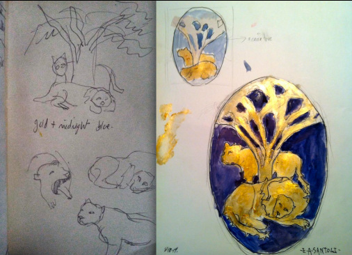
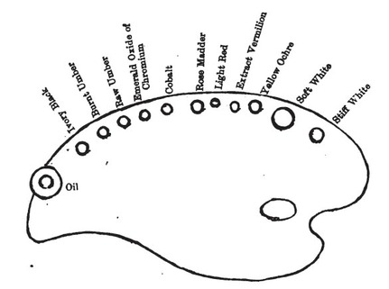
Artistically speaking, this has implications to everything from color palettes to mediums and so on chosen for you, by businesses that profit from the non-adventurers. I walk into an art store and know exactly what I am getting because of the experience, but it's just like any store and being overwhelmed with choices. Which salad dressing do I choose if I have 50 choices? The best answer may be something as simple as oil and vinegar. I wrote a little while ago about this limit of choice, but I am now thinking that it is more about being decisive about what works for you and where to draw the line. It's critical to gain experience and know what to do and when to do it. This all ties to the fact that when you walk into the store, you are bombarded with advertising trying to make choices for you. And it is a tempting trap to fall into. Be strong in your convictions and gain experiences by adjusting the recipe.  The best work--the true works of art-- are created with a purpose. They are created with a narrative that resonates through the painting. Throw-away sketches by artists who understand this principle are worth more than anyone creating paintings with no meaning. This revelation is something that I have noticed with my own work. When I step back and say "what have I made in the past that has satisfied me?"--the answer is paintings that are made with reason and judgement. Sure, a painting can be pretty and have all the elements that should create a strong painting. But there's always something missing. It's the thrill of the hunt, the hunt for the best possible way to convey my message. That is the missing piece with a lot of meaningless art. Purpose is the reason for the journey. I'm currently working on designing a gold foil stamp for a unisex perfume. The commission calls for a male lion, almost asleep with a lioness alert and on the prowl. The shapes are more important because it's going to be a foil stamp, so the detail is lessened. The sketch pictured on the left was my initial idea, which came to me within five minutes. I had immediate inspiration, which I usually find is the case followed by the need for research. The sketch on the right is after doing some research on family crests and acacia trees, both of which made me think deeply. Interestingly enough, some species of acacia are so aromatic that their flowers are crushed into perfume, but I wouldn't have discovered this without the research. The shape of the tree separates the two lions and adds a setting for the pair of lions. I stepped back from the sketches and noticed that they satisfied me more because I didn't care about technique or creating a "pretty" picture. Of course, a pleasing composition is important, but that's insignificant if it doesn't help tell the story. Write a narrative within the sketch and it will translate to a worthy painting.  The daunting amount of choices is overwhelming in today's artistic and consumer markets. As painters, we have access to hundreds of pre-mixed and tubed pigments. This is a relatively new trend, since the metal tubes of the late 18th century let artists have access to dozens of new colors and pigments. Before all this, colors were ground by hand and pigments were limited and kept in animal bladders (cool and gross). But I'm going to open your eyes to the fact that artists should do more with less on their palettes. The studio that I work in using a simple palette of Naples yellow, cadmium yellow medium, raw sienna, burnt sienna, cadmium red, and raw umber. What I've been learning is that this forces me to be more creative when given fewer options. My own palette that I paint with is relatively limited as well: Flake White, Naples Yellow, Chrome Yellow Dark, Vermilion, Chinese Vermilion, Burnt Sienna, Venetian Red, Genuine Rose Madder, Cobalt Blue, Asphlatum (Made by Gamblin), Van Dyke Brown, Viridian and Ivory Black. This is a 19th century palette which covers all the needs of any figurative or landscape painting. Try out a limited palette and see if it frees up your creativity. Also note that color is secondary to value. And strong value is a product of strong drawing. Start with a limited palette as a model that you could build a strong palette from depending on what colors you need. Caravaggio nails it hard. *The palette image is taken from Solomon J. Solomon's book The Practice of Oil Painting and Drawing, It's one of the top art instruction books that I've read. |
Archives
July 2024
Categories
All
|

 RSS Feed