|
For anyone who missed my lecture or for anyone who wants to watch it again: it is now available to watch online through the Atelier at Flowerfield's Youtube Channel. It's also time-stamped so you can go back to specific parts of the lecture. You can watch it here on my blog by clicking the "play button" below.
0 Comments
One thing I think about a lot is how I started doing the things that I love. What are the crucial moments where I said, "I want to do that". I think about these moments as windows of inspiration; they are basically times in my life, people and other experience that have really influenced me.
For instance, I started drawing as a kid and really felt my first burst of excitement for drawing when I watched Dragon Ball Z. I vividly remember being 9/10 years old and desperately wanting to draw like Akira Toriyama (the creator of Dragon Ball Z). I was really influenced by some early drawing books that I had and that I got at the elementary school library. I remember having one drawing book that showed you how to draw Yoda from Star Wars and I drew it and felt completely addicted. I'm not really into Star Wars, but that drawing book changed my life. A few years later I remember watching a PBS documentary about John Singer Sargent and they showed a portrait that Sargent painted of John D. Rockefeller; I was blown away by this also--I can't even really explain the feeling of intense fascination. Flash forward to when I was at the Pennsylvania Academy and I met my friend, Asem Ahmed, and he introduced me to the work of William Bouguereau. I was subsequently obsessed with Bouguereau for the next 5 years. I still love Bouguereau, but I've become more interested in other painting styles. Later, I worked at Sotheby's auction house in 2013. They had an exhibition space on their upper level floor so I went upstairs and was looking at an exhibition of works for sale and they had one painting by an artist that I had never heard of: Joaquín Sorolla y Bastida. This is the painting that was in the exhibition sale. The photo doesn't do it justice, but I was completely blown away by it. The light and color hit me so hard and I still haven't shaken the feeling. I later visited the Museo Sorolla in 2018 and came back with an urge to paint en plein air in bright sunlight. Those plein air paintings became the basis for my application portfolio to apply for the Munn Fellowship Award. I think a part of my interest in impressionist painters is also because of my colorblindness. Maybe I should have been more of a tonalist painter, but I can't help but having a love affair with the impressionist palette of colors. My art is also influenced by the work of Hayao Miyazaki. While I was in college, I had a writing teacher at PENN who introduced me to Miyazaki. I've become a complete Studio Ghibli fanboy since then. The narratives, artwork and style of Miyazaki films have left a deep impression on me. Another thing I love to do is skateboarding. I was interested in skateboarding at a young age and one memory that is burned into my mind is seeing a guy who lived down the street skateboarding, I saw him skating and was enamored. All I know is his name was Bill and he had really long hair, but I want to thank him for that brief window of inspiration. A larger window of inspiration was from my Opa. I'm continually inspired by him because he loved Motorcycles, engines and he also was good at drawing; my Mom says I have the same sense of humor and I look like him also. (He was colorblind too). I still remember the smell of his motorcycles in his garage. I also feel thankful that I grew up in the early internet and pre-cellphone days because you often had to get inspiration first hand or hear things through the grapevine instead of seeing them on youtube or wherever; it has more power and impact when you get the first hand experience. I could go on and on, but I just want to keep my eyes and ears open and try to keep cool people around me, read good books and most importantly to just keep doing what I love. Really fascinating look into the process of natural dyeing. As an artist who's interested in pigments and colors of the past, this really interested me. I think a big part of my desire to study color and the history of color is because of my own colorblindness (color deficiency). I always felt a need to try and conquer my colorblindness and maybe train my eyes to see color. Of course that's not how it works, but I love color regardless. I had a revelation this morning about the colors on my oil painting palette. I always spend a lot of time thinking about which colors to use and which colors I actually need. It's really hard some times because it's easy to get influenced by your artistic heroes and think that if you use the same colors, then you'll paint like them. The truth is that you should use colors that you like. Of course, the only way to figure out which colors you like is to test out a bunch and then figure out which ones work for you and which ones don't. I'm attaching a picture of my current palette below, which is combination of colors that work for me. Always remember that you can tailor your palette for specific subjects. For instance, if I'm painting a landscape with a lot of greens and blues, then I'm not going to put out all my reds because I don't need them. You could argue that you could mix reds into your greens to neutralize them, but I don't mix color that way so I know I don't need them. And, if suddenly, a red bird lands in the scene, then I can just put a little bit of red on my palette. What I've realized is that it's good to learn about what colors artists of the past have used and to test out those colors as a guide. But to progress as an artist, you'll need to think for yourself and see the world with your own eyes. You'll eventually realize that the colors you use don't actually matter that much. And if you've practiced enough, then you can make a great painting just using the most basic palette! *Many of my readers may know this, but I'm colorblind so I've spent a lot of time studying color for this very reason. Also because of this, I set up my color palette in a unique way that works for me. I always encourage everyone to work in your own style and always experiment with color! 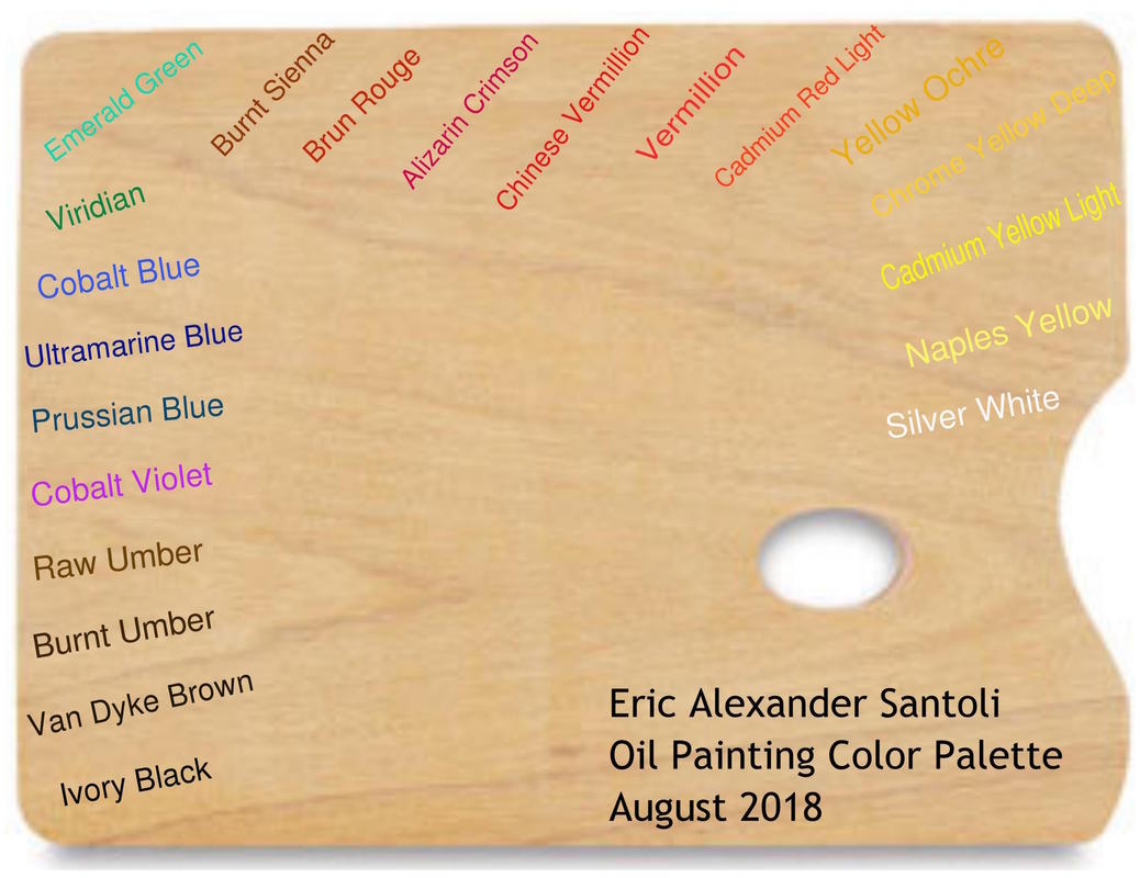 |
Archives
July 2024
Categories
All
|
 RSS Feed