
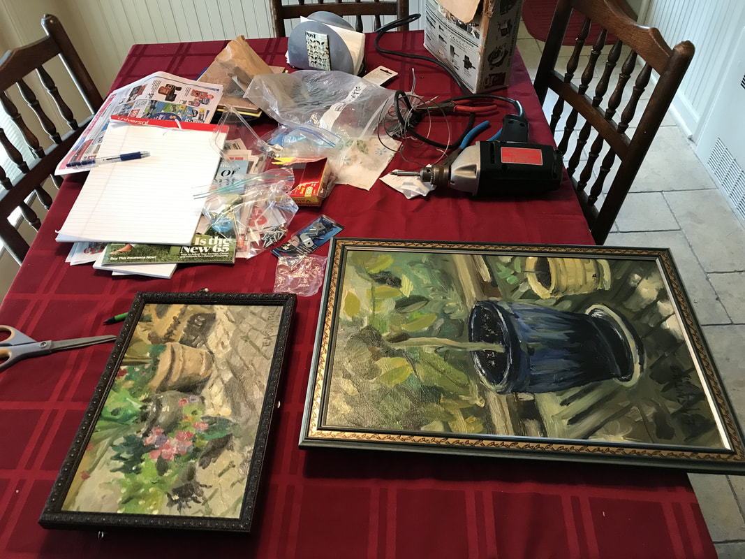
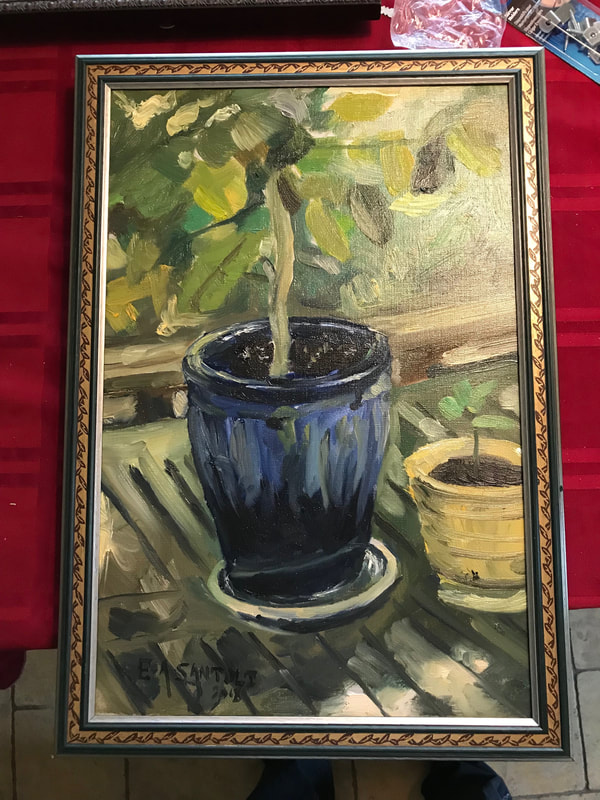
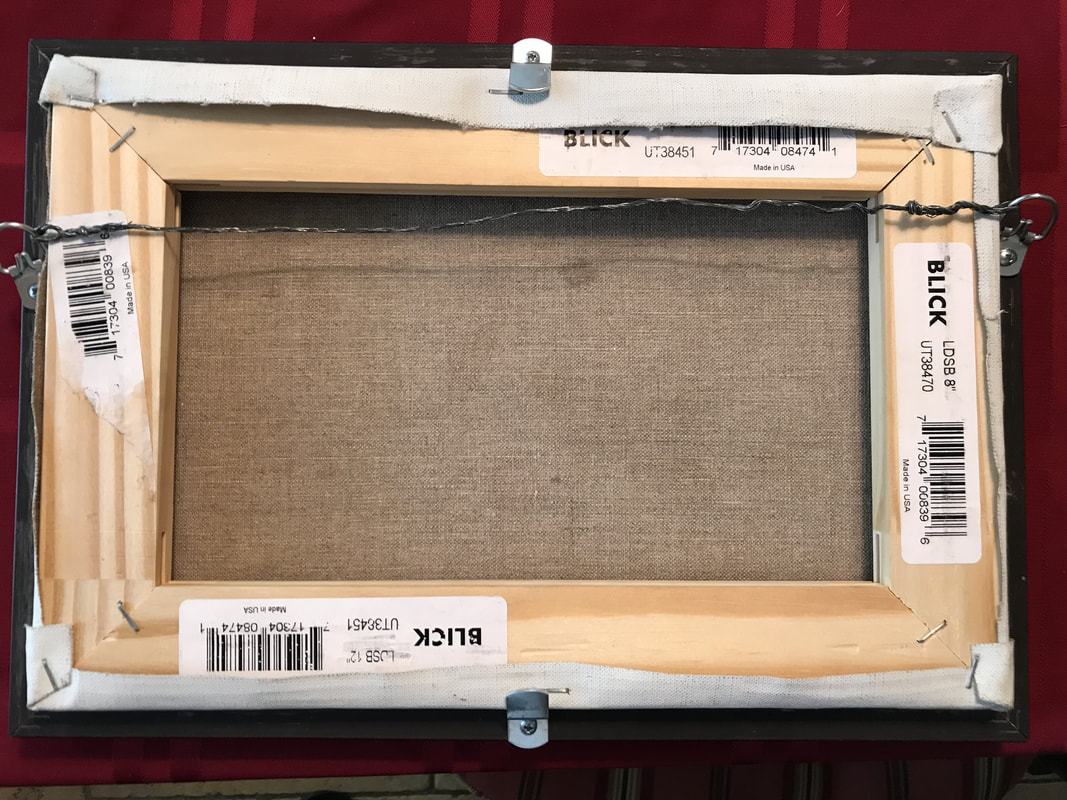
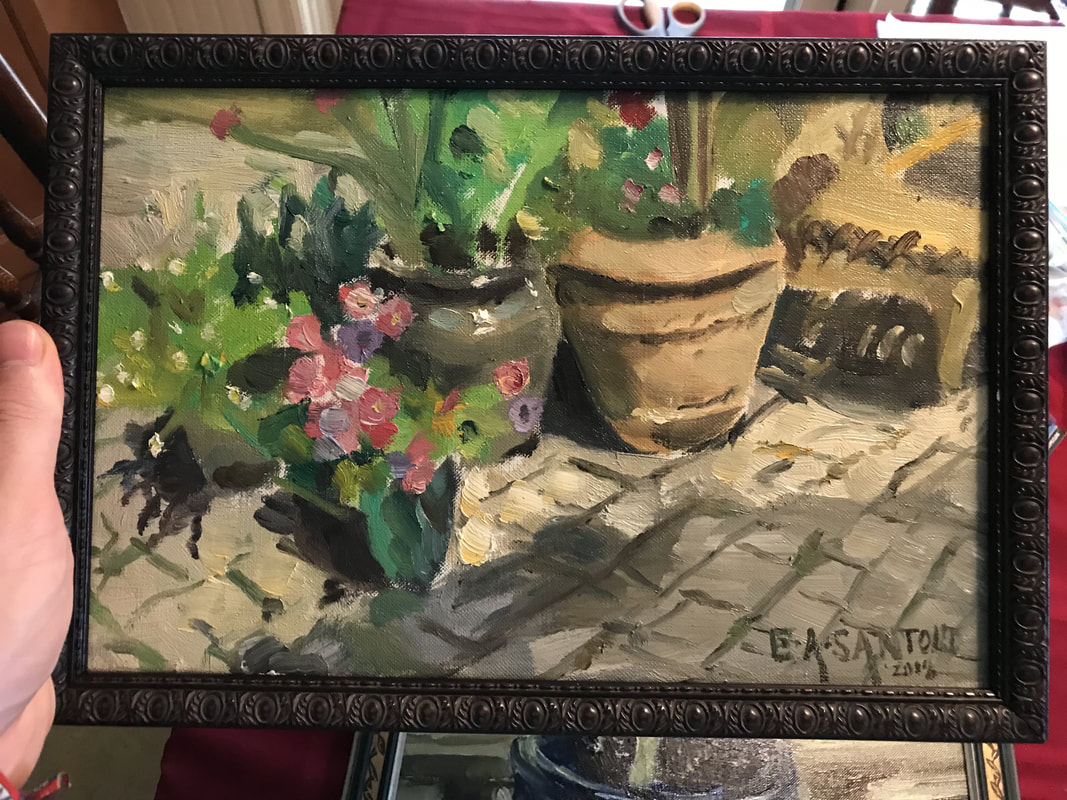
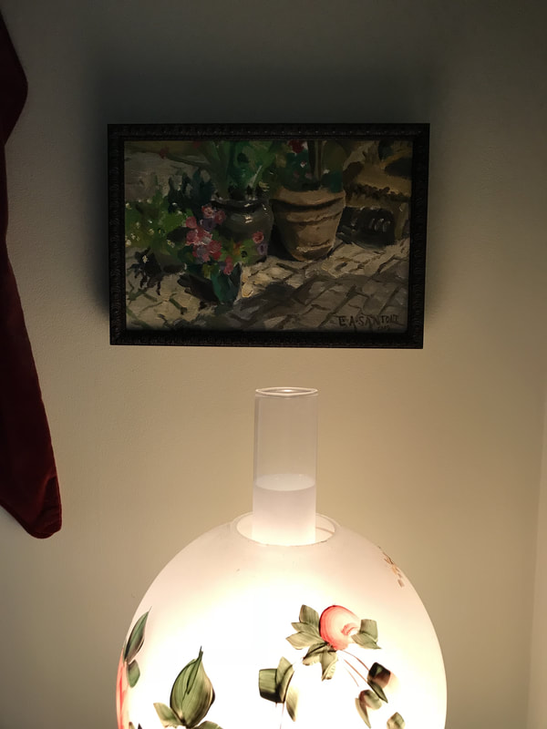
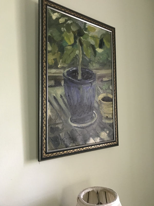
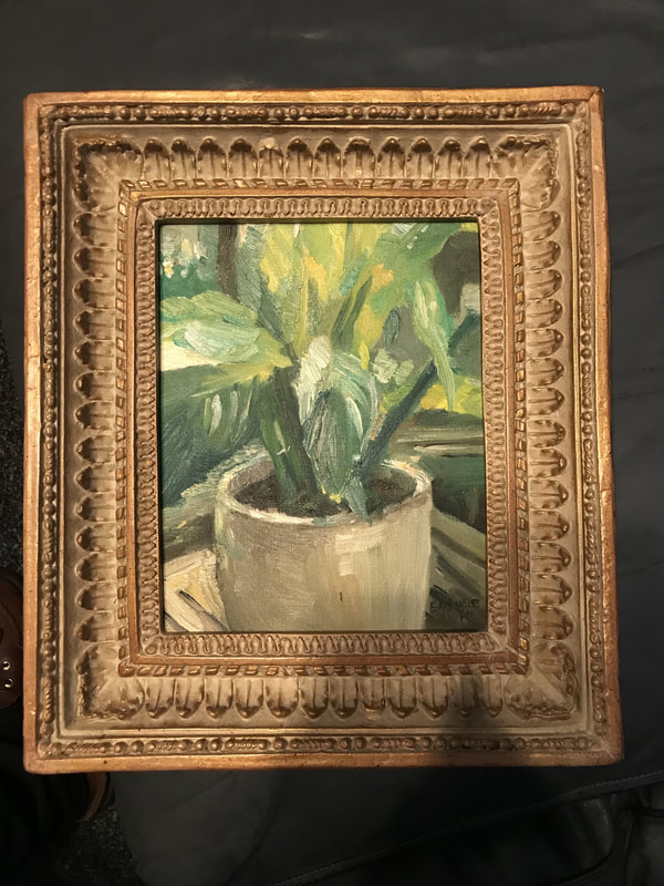
Hanging New Paintings With New Frames! + Tips for Buying Custom Frames and Doing Your Own Framing8/27/2018 Putting a nice frame on a finished painting is an amazing feeling and can really make a painting look even better. Anyone looking for custom frames should check out Art To Frames, which has great custom sized frames in a wide variety of styles. Most of the frames pictured below came from Art To Frames, except the last frame in gold, which I got lucky and found at a local goodwill. I used to make my own frames so I really enjoy the hands on aspect of framing also. It's pretty simple to put a canvas in a frame, you'll just need some basic supplies, such as hanging wire, hanging hardware and some offset clips (sometimes called mirror holders); these are important to hold the canvas into the frame. I've seen some people drive a nail through the stretcher bar into the frame, DON'T DO THAT because it weakens the stretcher bar and cause some serious problems. Have a great week everyone!
1 Comment
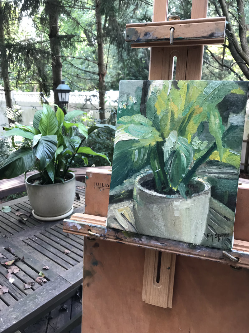
There are no absolute truths Painting is definitely one of the most difficult things a person can attempt. There's so many unknowns and so many choices to make. I've personally been struggling with so many questions for a number of years now but I just had a revelation today about using my own judgement. My latest revelation came up because I recently varnished a bunch of my paintings. After the varnish dried, I was looking over them and going back and forth between whether or not to put a second coat or not. I was being pulled back and forth until I realized something. I wasn't looking at each painting individually, I was thinking of it as an absolute whole. I realized that some of the paintings needed a second coat and some of them didn't. So then you could ask yourself, how do you decide which ones need a second coat and which ones don't? That decision is made through your own judgement. I looked at each painting individually and decided whether or not I liked the surface quality. I saw that some areas of the varnish were too sunken in and the other paintings had a nicely uniform surface. What I found is that each painting accepted the varnish a little differently. This could be affected by a ton of different factors from the humidity in the air to how much varnish I applied. I realized this is also true of my color palette. When I begin a painting from now on, I'm going to use my judgement to decide what colors I need for that particular painting. This is revolutionary for me because I finally feel like I have some clarity after many years of confusion. An example of this is if I'm painting a field of grass, then I need greens, yellows, white, browns and maybe some blues, but I know I definitely don't need a bunch of reds or oranges. This idea was reinforced after I saw a photograph of Sorolla painting in his garden with only about 5 colors on his palette. I realized that there is no standard palette for a professional artist. I really love Sorolla because he represents a direct sincerity and truth, rather than a focus on superfluous technique. I wish there were an easy way to predict the results and an easy way to make decisions, but the truth is that there isn't. All you can do is keep working, keep testing out knew things and keep gaining experience. 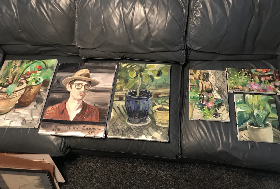 I did a quick study of a house plant today with a new palette set up. This new palette is very similar to my usual palette, except with a few additions. I've added cadmium yellow light, cadmium red light, rose madder, alizarin crimson and prussian blue. I've also switched out venetian red for a brown red, which I like more. I didn't have any cadmiums on my palette for a while because I felt like they were too powerful (same thing with titanium white). I added them back on my palette to add another level of intensity for my yellows and reds, which I really enjoyed. I still prefer silver white (zinc + flake white) instead of titanium, which I find to be too cold and chalky. Prussian blue is a color that I used to use years ago and I like having it back on my palette. It's basically a very deep greenish blue, that comes in handy for darker greens. I switched out Venetian red for a different earth red called Brun Rouge because Venetian is kind of a weird earth red that I didn't find useful. I always want to stress that the colors you use should be colors that you find useful. For a beginner, it's good to try out a basic palette, but remember to keep testing out new colors and find colors that work for you. I think every artist knows the feeling of overworking a painting or a drawing. And this is something that I've wanted to write about for a while because I think it's the difference between professional work and amateur. If you like the freshness of the work by artists like John Singer Sargent and Sorolla, then I'm going to share some of my own insight about how to avoid overworking a painting. 1. It's better to leave a painting slightly unfinished, instead of working something to death. The painting will look worse if you get finicky with the color and overall painting. It will lose the freshness and spontaneity that you want. 2. Stay far away from your subject! What I mean by this is to not get too close to whatever you're painting. This is easier when you're painting from life, but if you're using photos on your computer or phone, then DON'T ZOOM IN. I know it's tempting to zoom in and see every detail, but trust me when I say that it will only make it harder to paint. Details in a painting are always secondary to the larger value structure and composition. 3. Don't mess with it. This is always easier said than done, but you must learn to leave the painting alone. This is especially true when you're working with watercolor because watercolor painting is very fragile. Never use two strokes, when one stroke will suffice. So this is what I've been thinking a lot about recently, and I hope that it helps shed some light on this really important topic. Remember to keep painting, keep practicing and have fun!  |
Archives
July 2024
Categories
All
|


 RSS Feed