|
I've gone back and forth with palettes over the years. I've written about techniques in depth, but my recent business with EAS Custom Canvas has made me rethink some things. I used to believe that palettes (pigments) don't matter so much. This is what they taught me in school; all whites are the same, whether they be titanium or silver, blah blah blah. The motto for my canvas company is "The Surface Matters" because pigments and techniques matter. We used acrylic 'gesso' grounds at school because it was the only option we knew of. Luckily, I spent many hours in the library studying 19th century techniques because I knew there was a difference between their materials and what we use today.
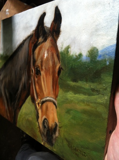
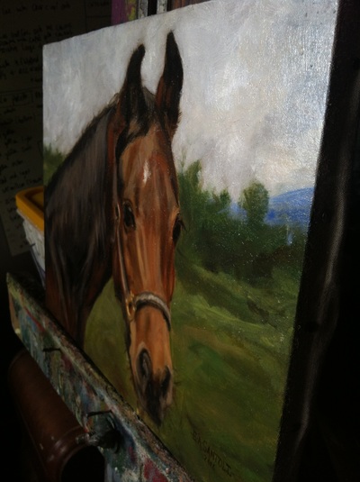
After you've reached a certain level of ability, the materials you use matter. Painting on an oil ground with a classical palette will not automatically make you a great painter BUT it will help you. Acrylic 'gesso' grounds with modern pigments will definitely hinder your growth. I recently went back to a 19th century palette in the vein of Bouguereau and Rosa Bonheur. I had used a hybrid palette previously on paintings, but I wanted to see the difference between using modern pigments and 19th century pigments. Some of the pigments are modern versions of older pigments such as asphaltum by gamblin (Pigment: Transparent Mars Red, Bone Black (PR 101, PBk 9) but it's a fairly accurate. I highly recommend using Fragonard paint for recreating a 19th century palette. I noticed that the greens I was able to mix were much richer than when I used modern, heavy cadmiums. I know cadmiums were available in Bouguereau's time, but I see why he favored chrome yellows. The whites also made a huge difference. Lead white and silver white (lead+zinc) are much softer and more transparent than titanium, which feels heavy and chalky. It's tough to put into word, but lead white feels like you're painting with transparent clouds. Once again, the danger here is in thinking that you'll paint like an academic master simply by using these colors and oil grounds. That is completely wrong, it takes many years and I'm only just beginning my journey. My goal is to take from the past and add my own techniques to the melting pot. If you're interested in these techniques and you admire the past (instead of being intimidated by it), remember that you're not alone. My art school days were filled with people asking me questions about why I love Bouguereau and the 19th century. You never have to defend beauty and truth so my answers were always simple, which often incited more confusion and bewilderment. I would always just keep painting because it's not worth arguing about it; we can all recognize skill, beauty and truth. My last tip is to check out a site called rationalpainting.org, you have to sign up to be a member, but it's an amazing site, filled with great information.
0 Comments
Your comment will be posted after it is approved.
Leave a Reply. |
Archives
July 2024
Categories
All
|


 RSS Feed